コミュニケーションブランド
コミュニケーションブランドメッセージを見る
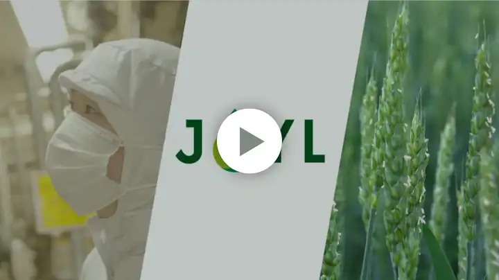
あぶらを原点にJOYLが
あふれる未来をかなえる。
そんな想いをJOYとOILを合わせることで生まれるJOYLを描き表現しています。
ロゴマークがあらわすもの

私たちは、ジェイオイル。
あぶらを原点に、自然の可能性を引き出し、 今日を生きる一人ひとりのJoyと、地球環境のJoyをどちらもかなえてゆく。 そんな想いを、“JOYL”という表記に込めました。
テーマカラーはグリーン。 あぶら・でんぷん・たんぱくを生み出す植物を信じて サステナブルな未来に貢献するという意志をあらわしています。
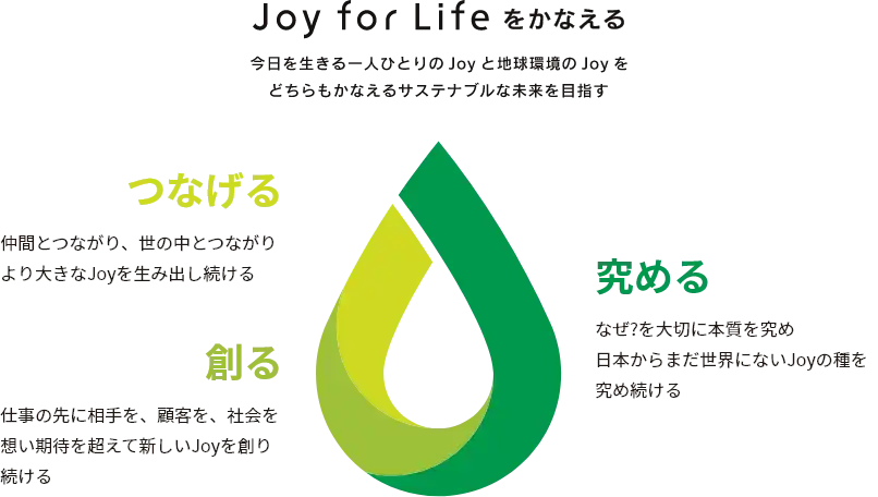
油滴のマークの3つの色には、 自然の恵みの可能性を引き出すための知識や技術を「究め」、 仕事の先にいる人々を想い、その期待を超えるJoyを「創り」 、仲間や世の中と「つながって」生み出すJoyを大きく育てたいという、 私たちの決意が込められています。
「グリーンの油滴」に込めた想い
「Joy for Life®をかなえる3つの原動力」
JOYLロゴのOは、油滴をデザインしています。 これは、あぶらを原点に領域を超えてよろこびを拡げ、Joy for Life®をかなえたいという想いが込められています。 油滴マークの3つのグリーンにも、それぞれに想いが込められています。
Our new “communications brand”, JOYL, is a way to express our philosophy of joy.
As a supplier of edible oils by reaping nature’s potential to support diets,
we aim to bring joy to the people through our attention to minimizing environmental impact.
Our theme color is green, drawing attention to the plants that produce oils, starches, and proteins.
The color also expresses our determination to contribute to a sustainable future.
Three colors of the oil drop represent our determination to maximize the joy we create and include the following meanings;
1) to quest for the knowledge and technology to harness nature’s bounty,
2) to create joy by exceeding stakeholders’ expectations,
3) to interact with people and society.